
You must have noticed that stocks in stores are often marked in yellow, orange or red. These colors are inevitable when it comes to signs that attract customers’ attention.
But why are these colors so popular and how effective are they really? In this article, we will explore the reasons behind this practice, its effectiveness, as well as understanding the science called – color psychology.

If we take into account that every Homo sapiens sapiens (today’s man) is primarily an emotional, and then also a visual being, it is clear to us that the entire philosophy of the consumer society, which directed its norms and behavior through the consumption of goods and services, is defined precisely through emotions. Why would we buy anything if we don’t have an emotion about it, we don’t buy because we are told, but because we “feel something” about it?
Any color it causes certain emotions, that’s why it’s no wonder that the psychology of colors and the knowledge of the effects of colors on human behavior have been talked about so much in the last couple of decades. That’s why people who deal with design, marketing, branding and sales have to familiarize themselves with the emotions of what color it is, with the habits of their consumers, fonts, modern sales techniques and tools, etc. I will disclaim that reactions to colors generally differ by gender, culture, age (old age), but the brain of Homo Sapiens Sapiens is the same in every part of the planet Earth.
Here is an example:
1. Different cultures may react differently to colors. For example, the color red in China symbolizes luck and prosperity, while in some Western cultures it can symbolize danger.
- In digital marketing, colors are used in a similar way as in physical stores. “Buy” or “subscribe” buttons are often red or orange to encourage immediate action (so-called Calls to action, call to action ).
The use of bright colors (active colors) to highlight actions dates back to the middle of the 20th century. century when marketers began to investigate the psychology of colors. As marketing has evolved, these techniques have been refined. Today, these colors are the industry standard due to their proven effectiveness in attracting attention and driving customers to action.
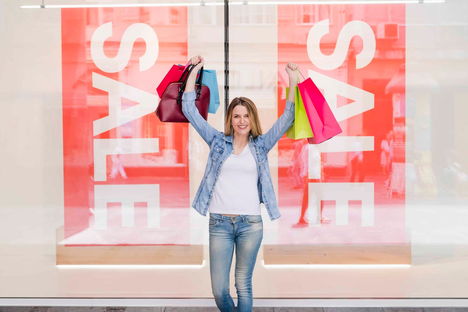
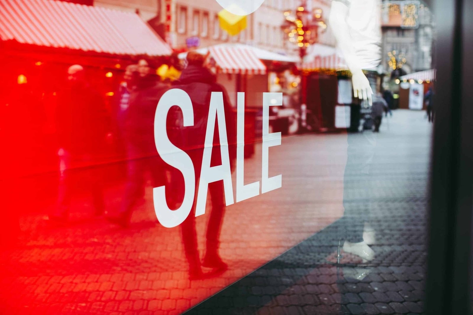
Why are stocks in stores marked in yellow, orange and red?
The very definition of yellow is that it is the color of the Sun, and all of us Earthlings are like sunflowers – we revolve around it and we love it when it branches and illuminates our hearts and faces, that’s why yellow is the color of happiness. Let’s ask ourselves why they are life jackets on ships and boats always yellow, and not, say, purple? Red , yellow and blue are the three basic (primary) colors from which everything starts. Red is the first color that the human eye sees (at birth), so it somehow awakens the strongest and best (but also the worst) emotions in us. Yellow , which is also the primary color, is the fastest to be noticed by the peripheral vision, so it is completely logical that if there is a shipwreck, we will first see something yellow, such as a life jacket. That’s why traffic signs and road signs are mostly in a yellow-black combination or red, white, black. This color is often associated with happiness, energy and optimism. It’s easy to spot, even from a distance, making it ideal for attracting attention.
That’s why brands use yellow color psychology to easily attract consumers to their stores because yellow in its essence evokes warmth, cheerfulness, but also attracts a lot of attention, it is used to increase self-confidence. Many brands use one of the most ideal combinations: yellow and black to leave an impression and recognition. But, as I already tell my students at the training: “Every color is like medicine, and we know that medicines have their side effects and contraindications.” We must not exaggerate with colors, especially not with yellow, because if there is no balance and measure, then yellow is counterproductive and too difficult to look at, but also too cheap a technique to increase sales in stores.
Why the orange color: Although it is a secondary color, it is created from the combination of the highest energy carried by the color red and yellow (which causes happiness). This color encourages a sense of enthusiasm and urgency, which can motivate customers to respond immediately to promotional offers.
Why the color red: Because it is the most intense color in the spectrum, the primary color, red evokes a sense of urgency and excitement. It can increase the heart rate and create a sense of urgency and excitement, which is ideal for promotions and sales. It increases appetite (it’s not red KitKat for nothing) but since every color is like a medicine, the side effect is the stimulation of aggression and discomfort. So the next time you reach for a sweet with refined sugar, first ask yourself if you are surrounded by pink or red, because they have the task of increasing the desire to consume food and sweets. That’s why red always initiates more impulsive purchases, but also love, right? Red is also the color of warning and danger (notices about dangerous products).
Studies have shown that these colors actually increase the likelihood that customers will notice and respond to promotional offers. Their use can significantly increase sales during promotional periods.
Does everyone use only active colors: red, yellow, orange, pink to attract attention?
Although yellow, orange and red are the most commonly used colors to highlight actions, they are not the only ones used. Depending on the brand and target audience, some stores use other colors (to a lesser extent):
1. Blue color – It is associated with trust (loyalty), stability and calmness. Although less often used for actions, it can be effective in specific contexts, especially with brands looking to build long-term trust. When it comes to food and appetite, it is by no means recommended to use green and blue because they are opposite (passive) colors to red and orange.
2. Green color – Symbolizes freshness, growth and environmental awareness. Stores that sell organic products or want to emphasize the freshness of their products often use the color green.
3. Purple color – It is associated with luxury and quality. It can be used to promote luxury products or special (exclusive) offers.
Summary
It is no coincidence that yellow, orange and red are the colors most often used to highlight promotions in stores. Their psychological power to attract attention and incite action makes them extremely effective tools in marketing. Although there are other colors that can be used, these three remain the most popular because of its proven effectiveness. As the market evolves, so do color strategies, but the basic principles remain the same (for now).
If you’re a store owner or marketer, understanding the psychology of color can help you get the most out of your promotional campaigns. Always keep your target audience in mind and adjust colors for maximum effect.